Have you ever wondered how to visualize complex data flows in an intuitive and impactful way? Sankey Diagrams could be your answer. These diagrams are powerful tools for illustrating how material or energy is distributed across different components of a system.
Unfortunately, Excel doesn’t provide built-in support for Sankey Diagrams, but don’t worry! This blog post will guide you through using third-party tools to create visually stunning and informative Sankey Diagrams right in Excel. By the end of this post, you’ll be equipped to effectively represent data flows, enhancing your data analysis and presentation skills.
With confidence, this guide will walk you through the process of creating a Sankey Diagram in Excel Using the Best Sankey Diagram Generators, transforming raw data into a compelling narrative that highlights key relationships and efficiencies. Whether you’re analyzing business processes, energy consumption, or financial transactions, mastering the Sankey Diagram in Excel will elevate your data analysis and presentation skills to the next level. Let’s dive in and make your data speak volumes.
Let’s start by understanding the Sankey Chart and its components so we know how to create it easily in Excel.
Understanding Sankey Diagram
What is a Sankey Diagram?
Definition: “A Sankey diagram is a visualization used to depict a flow from one set of values to another.” Source: Google Developers
The Sankey Diagram is one of the most used types of flow diagrams, which shows/presents the flow between 2 or more dimensions. Researchers, analysts, and professionals like this diagram because it helps them to find the flaws in their system by presenting the flow of data in a complete process.
Sankey Diagrams are named after Irish Captain Matthew Sankey, who first used this type of diagram in 1898 to depict energy efficiency in a steam engine. The beauty of a Sankey Diagram lies in its simplicity and clarity; it uses arrows of varying thicknesses to show the volume of flows between different nodes in a network. These diagrams are particularly useful in fields such as energy management, material flow analysis, and cost breakdowns, where understanding the distribution of resources is crucial.
Let’s first learn about the components of the Sankey Diagram.
Components of a Sankey Diagram
Sankey Diagrams are comprised of several key components that work together to convey data flows effectively. Understanding each element is crucial for constructing and interpreting these diagrams accurately:
- Nodes: These are the points in the diagram where the flow originates, ends, or transitions. Nodes are typically represented by labels such as departments, processes, or stages in a system.
- Flows: The paths that connect nodes, representing the quantity or volume of the item being tracked, such as materials, energy, or money. The thickness of each flow line is proportional to the flow quantity, making it easy to visualize larger flows at a glance.
- Arrows: These indicate the direction of the flow, helping to guide the viewer’s eye through the data from source to destination. The directionality is essential for understanding the transfer of resources or data.
- Labels: Textual annotations used to clarify what each node and flow represents. Labels are crucial for readability, especially in complex diagrams with multiple flows.
- Color Coding: Utilizing different colors for various flows or nodes can greatly enhance the readability of the diagram. Colors can be used to distinguish between different types of resources, to show different stages of a process, or to highlight inefficiencies.
- Scale: A key at the side of the diagram indicating what the flow widths mean, providing context to the diagram’s quantitative elements.
Integrating Components Effectively
To integrate these components effectively into a Sankey Diagram in Excel using third-party tools or add-ons, consider the following steps:
- Identify Nodes: Determine what stages, processes, or elements will serve as nodes. Place these strategically on your layout to reflect the flow’s progression logically.
- Map Out Flows: Connect these nodes with flows. Adjust the thickness of each flow based on the data volume it represents, ensuring that the proportionality is clear and visually intuitive.
- Implement Directionality: Use arrows to indicate the direction of each flow. This helps in guiding the viewer’s understanding of how resources move through the system.
- Apply Labels and Color Coding: Label each node and flow as needed and apply color coding to enhance differentiation between different types of flows or to highlight particular paths.
- Set a Scale: Include a scale that explains what the widths of the flow lines represent. This is essential for viewers to understand the quantitative aspects of the diagram.
By understanding and effectively implementing these components, you can create Sankey Diagrams that not only convey complex data efficiently but are also engaging and easy to understand. This makes them powerful tools for presentations, reports, and data analysis projects.
Why Excel for Sankey Diagrams?
Microsoft Excel is a ubiquitous tool in data analysis, known for its flexibility and wide range of functionalities. While it does not support Sankey Diagrams natively, the vast array of available add-ons and Excel’s robust data-handling capabilities make it a viable platform for creating these diagrams. Using Excel allows you to leverage its data manipulation tools together with add-ons specifically designed for Sankey Diagrams, providing a seamless experience from data preparation to visualization.
Now, let’s go to the main part of the blog, How to Create a Sankey Diagram in Excel.
Step-by-Step Guide to Creating a Sankey Diagram in Excel
Preparing Your Data
To create a Sankey Diagram, your data must be structured to show the flow from one point to another. Typically, you’ll need at least three columns: Source, Target, and Weight, where Weight indicates the magnitude of each flow.
Organizing Data in Excel
Start by organizing your data into columns corresponding to each element of the flow. Ensure each flow’s source and target are clearly defined, and verify that the data types are consistent to avoid errors during the diagram creation process.
Installing Necessary Add-ons or Tools
Due to the useability and popularity of the Sankey Chart, there are many tools online that you can use to create it. Excel does not have a Sankey Diagram in its charts, but there are ways that you can use to create a Sankey Chart in Excel.
While several tools are available, Excel add-ons like “ChartExpo”, “Power User” or web-based “Excel Sankey Diagram Generator” are popular choices. Install these tools by downloading them from their respective websites and adding them to Excel through the Add-ins menu.
Setting Up Your Excel Worksheet
Arrange your data in the spreadsheet according to the requirements of the Sankey Diagram tool you have installed. Make sure your data is clean, with no missing values in the flow paths.
Creating the Sankey Diagram
There are 3 ways that you can use to create Sankey Chart in Excel:
- ChartExpo add-in for Excel
- Power-user add-in for Excel
- Creating a Simple Sankey Diagram in Excel for free without using any Add-on
1. ChartExpo add-in for Excel:
Sankey Charts are straightforward to create in Excel once you have set up the proper environment. To make this chart, you first need the data in the appropriate format, and the second required thing is the ChartExpo add-in for Excel. Follow the steps below to create Sankey Visualization in Excel using ChartExpo.
Step 1: Open Excel and prepare Data
Open your Excel applications and prepare the data on which you want to draw the Sankey Diagram.
Step 2: Select Sankey Diagram Maker
- Go to the “Insert” tab and Click on Store. Now click on the search box and type ChartExpo.
- You will see ChartExpo for Excel in the search results. Click on Add.
- Alternatively, you can use this link to install it directly from Microsoft Store.
- Once you have installed the ChartExpo add-in in the Excel application, follow the steps below to create a Sankey Diagram in Excel.
- Go to the Insert tab and click on My Apps. There, you will see ChartExpo for Excel in your installed applications. Click on it and then click on Insert.
Step 3: Select Sankey Chart in Excel list of charts
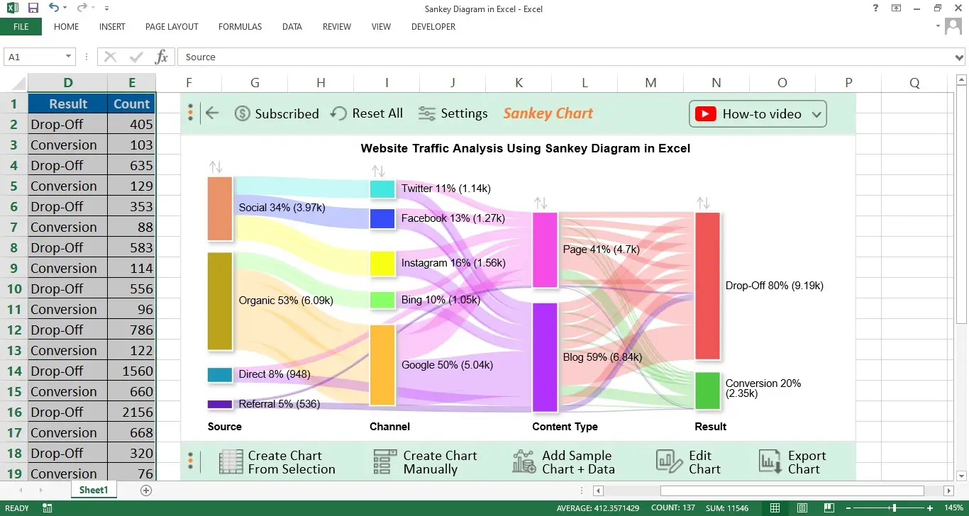
- You will see the list of charts this add-on offers. Click on the search box and type “Sankey Chart”.
- Click on the Sankey Chart, and a new window will open containing a sample Sankey Diagram.
Step 4: Select Data and Create Chart
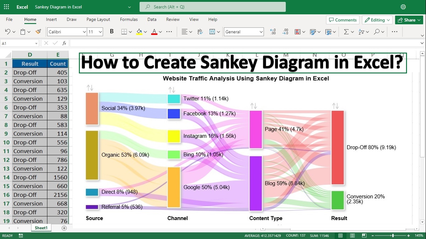
- Now select your data in the Excel sheet and then click on the “Create chart from selection” button.
- Here you go. Here is the Sankey Chart in Excel plotted on your selected data. By default, it’s in 1 color. You can edit this chart to customize it. Edit the color nodes and their fonts to meet your requirements.
Step 5: Enjoy the Final Sankey Diagram
Here is the final Sankey Diagram in Excel after customizing it which we created using our data.
2. Power-User add-in for Excel:
The Second add-in that you can use to create a Sankey Chart in Excel is Power User. First, you have to install the Power User add-in for Excel, which you can do by following the steps below:
- Visit their website at https://www.powerusersoftwares.com/.
- Go to Free Download and download the file.
- After downloading the file, install it.
- Now open your Excel application. Go to “File” and then look for “Excel Options” in the list.
- Now click on Add-ins and enable the “Power User” option.
- Once the add-in is enabled, you can see Power User in the top toolbar of MS Excel.
Let’s discuss how to create a Sankey Graph in Excel using the Power User add-in.
- Open your MS Excel application.
- Enter the data on which you want to create Sankey Chart.
- Go to the Power User tab in the toolbar.
- Select the data in Sheet and then Click Create Sankey Chart in the Charts Section of Power User.
- Confirm the range of the selected data and press OK to continue.
- It will create a Sankey Diagram in Excel for you.
3. Creating a Simple Sankey Diagram in Excel for free without using any Add-on
Creating a Sankey diagram in Excel, though not a straightforward process, can be achieved with a combination of chart manipulation and creative techniques. Here’s a detailed guide on each step to create a Sankey diagram in Excel for free without using any 3rd party add-on:
Step 1: Prepare Your Data
-
- Begin by organizing your data into three columns.
- The first two columns should represent the source and target of each flow.
- The third column will contain the numerical values indicating the flow magnitude.
- Source: List down the starting points of your flows (e.g., Dept A, Dept B).
- Target: Identify where each flow is directed towards (e.g., Project X, Project Y).
- Value: Assign numerical values to each flow to represent its magnitude.
Step 2: Create a Stacked Bar Chart
-
- Select your prepared data.
- In Excel, go to the “Insert” tab and choose “Stacked Bar Chart” from the chart options.
- You’ll need two separate stacked bar charts – one representing the sources and the other for the targets.
Step 3: Calculate Dummy Series for Spacing
-
- To create the Sankey effect, you need to introduce a dummy series that will act as gaps in the chart.
- This spacing is crucial for visually separating the different flows.
- The dummy data should be calculated in such a way that it positions the real data appropriately on the chart.
Step 4: Customize the Chart
-
- Adjust the gap width in the chart settings to 0%. This ensures that the bars in your stacked chart touch each other, forming a continuous flow.
- Use distinct colors for different flows. This helps in differentiating the various flows and enhances the visual appeal of the diagram.
Step 5: Create Flow Paths
-
- Using Excel’s shapes (like rectangles), manually draw paths that represent the flows between the bars.
- Ensure that the width of each flow path corresponds to the value of the flow it represents.
Step 6: Fine-Tuning
-
- Carefully align your manually drawn flow shapes with the corresponding bars in the stacked chart.
- To improve visualization, adjust the transparency of the flow shapes.
Step 7: Add Labels and Final Touches
-
- Use text boxes to add labels to your diagram, providing information like the names of sources, targets, and flow values.
- Ensure that your Sankey diagram is clear, easy to read, and understand.
ChartExpo vs. Power User:
Let’s compare both tools so that you can select the one that suits you better.
- Pricing: The ChartExpo subscription fee is $10/month while the cost is higher for Power User which is $18.75/month.
- Easy to Use: Both tools are easy to use. You can create charts in a few clicks without any coding.
- The Number of Advanced Visualizations: ChartExpo offers more advanced charts than Power User which you can use for data analysis purposes. But Power User also gives logos, diagrams, icons, and pictures.
- Trial Period: You can create charts using ChartExpo and Power User in your trial period as the trial contains most of the premium features to test.
Tips and Tricks for Enhancing Your Sankey Diagram
Creating an effective Sankey Diagram in Excel requires not just correct data input but also a keen eye for design and presentation. Here are some advanced tips to make your diagrams stand out:
- Balance Aesthetics and Functionality: Choose colors that differentiate clearly between flows but are harmonious and easy on the eyes. Use gradients for flows to indicate transitions or interrelationships.
- Use Transparency: Applying a slight transparency to flows can help in managing overlapping paths without losing visibility, which is especially helpful in complex diagrams.
- Label Strategically: Instead of labeling every single flow, prioritize the largest or most important flows for labeling to maintain clarity. Consider using interactive tooltips if your add-on supports them, which appear when hovering over a flow.
- Adjust Flow Curvature: Some tools allow you to adjust the curvature of the arrows. Smoother curves can make the diagram easier to follow and visually more pleasing.
- Consistent Scale: Ensure that the scale of flows is consistent and proportionate to their values throughout the diagram. This accuracy in representation helps in maintaining the diagram’s credibility.
- Interactive Elements: If your tool allows, make your diagram interactive. Allowing users to click on a flow to see more detailed data can make your Sankey Diagram a powerful exploratory tool.
Common Pitfalls to Avoid
Even with the right tools, creating Sankey Diagrams can be tricky. Here are some common pitfalls to watch out for:
- Overloading Information: While it’s tempting to include as much information as possible, too many nodes and flows can make your diagram unreadable. Focus on the main data flows and simplify where possible.
- Ignoring Flow Direction: The direction of the flows should be intuitive; typically from left to right or top to bottom. Confusing flow directions can mislead the reader’s understanding of the data.
- Neglecting to Test with Real Data: Always test your diagram with real, representative data to ensure it scales well and remains legible. What works with a small dataset may not hold up with larger, more complex data.
- Inconsistent Formatting: Use consistent styles for similar elements to avoid visual confusion. Inconsistent use of colors, labels, and line styles can distract from the data itself.
- Forgetting Mobile Users: If your Sankey Diagram will be displayed on web platforms, ensure it is responsive. Many users might view your diagram on smaller screens, where complex diagrams can turn into indiscernible blobs.
- Data Discrepancies: Before finalizing the diagram, double-check your data for any discrepancies or errors. Even minor mistakes can drastically alter the interpretation of the data flows.
By implementing these tips and avoiding common pitfalls, you can create Sankey Diagrams in Excel that are not only informative but also engaging and visually appealing.
Example Applications of Sankey Chart
Sankey Diagrams can be used in various industries:
- Energy Management: Visualize energy inputs and outputs within a system.
- Supply Chain Processes: Show material transfers from origin to destination.
- Budgeting: Illustrate how a budget is allocated across different departments.
Including real-life examples with screenshots in this section will provide practical insights into how Sankey Diagrams can be applied effectively.
FAQs:
Can you create a Sankey diagram in Excel?
Yes, you can create a Sankey Diagram in Excel. Excel does not have a built-in Sankey Chart in its charts library. To create a Sankey chart in your Microsoft Excel application, install third-party add-ons like ChartExpo and Power User.
How do I create a Sankey chart in Excel?
Follow the steps below to create a Sankey Diagram in Excel.
- Step 1: Open your Excel applications and prepare the data on which you want to draw a Sankey Diagram.
- Step 2: Go to the Insert tab and click on My Apps. There, you will see ChartExpo for Excel in your installed applications. Click on it and then click on Insert.
- Step 3: You will see the charts list; click “Sankey Chart”. A new window will open containing a sample Sankey Diagram.
- Step 4: Select your data in the Excel sheet and click the “Create chart from selection” button.
- Step 5: Here you go. Here is the Sankey Chart in Excel plotted on your selected data. By default, it’s in 1 color. You can edit this chart to customize it. Edit the color nodes and their fonts to meet your requirements.
- Step 6: You will get the final Sankey Diagram in Excel, which we created using our data.
What is the best Excel add-in for the Sankey diagram?
There are a couple of add-ins that you can use in Excel to create a Sankey Chart. However, considering the ease of use, ChartExpo surely beats all the competition. You can use the ChartExpo add-in for Excel to create Sankey Visualization in a few clicks without coding in a few minutes.
What is an alternative to a Sankey diagram in Excel?
Suppose you cannot use Excel or do not want to use Excel to generate a Sankey Diagram. In that case, you can use online tools like Google Sheets to create a Sankey Diagram. Do not worry; we will publish an article on creating a Sankey Diagram in Google Sheets soon.
Conclusion
With the right tools and techniques, Excel becomes a powerful platform for creating detailed and informative Sankey Diagrams. By learning to create these diagrams, you can enhance your ability to communicate complex data structures clearly and effectively.
Further Resources
To deepen your understanding of Sankey Diagrams and Excel’s capabilities, consider exploring additional resources such as online tutorials, specialized courses, and comprehensive guides on advanced Excel functions.
Sources:
- https://developers.google.com/chart/interactive/docs/gallery/sankey
- https://techcommunity.microsoft.com/t5/excel/creating-sankey-diagrams/td-p/911024
- https://chartexpo.com/blog/sankey-diagram-in-excel
- https://support.powerusersoftware.com/support/solutions/articles/80001021629-sankey-charts
By following this blog post, you’ll not only gain a solid foundation in creating Sankey Diagrams but also enhance your overall data visualization skills, making your presentations more impactful and data-driven.
With over two decades of experience in writing about Microsoft Excel, Google Sheets, and various other spreadsheet tools, Muhammad Nadeem Salam is your go-to expert for all things data. Since 2004, he has been passionately sharing his knowledge and insights through engaging and informative blog posts, helping countless readers unlock the full potential of their spreadsheet tools.


Thanks, it helped me a lot. There is only 1 issue. I create Sankey chart in Excel using ChartExpo. It worked just as you shown in the steps but I got a watermark on it. Is there any way around to get this done without watermark.
ChartExpo is paid tool. To create Sankey Diagram without watermark you have to pay $10 for 1 month.