Transform your Excel sheets from simple spreadsheets to storytelling tools with beautiful and intuitive “data visualizations in Excel”. This powerful feature turns complex data into clear, engaging visuals, making it easier to spot trends, patterns, and insights.
Data visualization in Excel represents numerical value in a visual format. It is the way to organize data in a spreadsheet in a more accessible and organized format. Confidently navigate through the myriad of chart types and customization options available in Excel to effectively communicate your data’s story.
Excel templates can be used for data visualization. Excel as a data visualization tool has several charts, graphs, and maps you can use to visualize your data, like bar graphs, line charts, pivot tables, etc.
This guide will take you step-by-step through creating impactful data visualizations, ensuring your presentations and reports stand out with professional polish and clarity. Let’s dive in and bring your data to life!
What is Data Visualization in Excel?
Definition: Data visualization is the graphic representation of data that makes it easier to interpret. We can create Data visualizations using tools like Data Wrapper, Google Charts, and others. Additionally, data is organized and visualized using an Excel spreadsheet.
Let’s explore Excel’s data visualization features in many different ways. We can use different Excel charts and graphs to visualize data. Additionally, data visualization using Excel templates is possible.
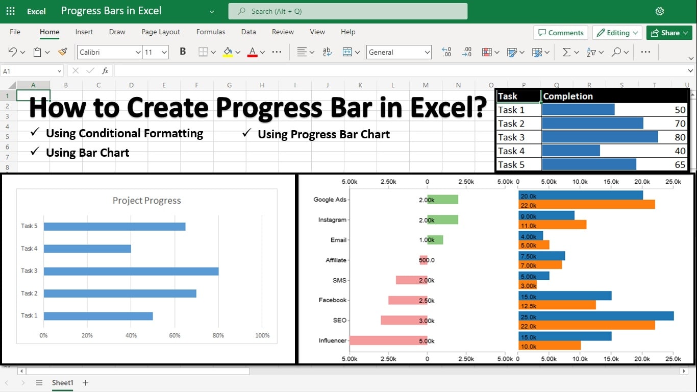
Column charts, bar charts, pie charts, progress bars, line charts, area charts, scatter charts, surface charts, Sankey diagrams, and many others are available in Excel.
Different Types of Data Visualizations in Excel
Excel can be used for several data visualization techniques, including:
Column Chart
It is a simple type of graph where data is shown as vertical bars. Select the data and the required option from the Column chart menu to build a column chart. As we can see, several options exist for the Column chart; the best option must be picked.
The chart can be formatted as required.
Pie Chart
Pie charts or diagrams display the percentage share each data type makes up. The pie chart helps us rapidly understand the proportion contribution. To create a pie chart, pick the required columns, then pick the relevant pie chart option from the Pie menu.
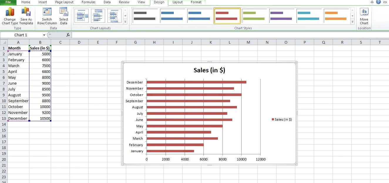
Bar Graph
Horizontal bars are the only difference between this chart type and a column chart. Select the suitable bar chart from the Bar option to make a horizontal bar.
Line Graph
A line graph is commonly drawn to show data that changes over time. It consists of two axes: the x-axis and the y-axis. Each axis represents a different dataset. It is formed by connecting a series of points using a straight line.
It can be used to check whether the values are increasing or decreasing over time.
Pivot Table
A pivot table is a tabular representation of data used in data visualization that is used to group, sort, and summarize huge volumes of data.
Advanced Excel Charting Techniques
There are the following advanced Excel charting Techniques used for data visualization:
Combining multiple data series
When you have multiple data sets that you want to compare in a single chart, you can combine them into one chart using Excel’s capability to handle multiple data series. Here’s how to do it
- Ensure that your data is organized properly. You may have two columns or rows for categories (e.g., months and sales)
- Highlight the entire dataset, including the category labels and all the data series.
- Go to the “Insert” tab in Excel’s ribbon, and select the chart type that best suits your data. Common choices include clustered column/bar charts for comparing data in different categories or line charts for showing trends.
- Excel will create a basic chart with all the data series. You can further customize the appearance of each data series by changing colors, styles, and labels. It helps differentiate and highlight each series.
- If you have multiple data series, including a legend in your chart is crucial. The legend identifies which color or symbol corresponds to each data series.
- Enhance the visual appeal of your chart by adjusting fonts, colors, and chart elements as needed.
Creating pivot charts
Pivot charts are powerful tools for summarizing and visualizing large datasets quickly. They work with pivot tables to provide a dynamic way to analyze data. Here’s how to create a pivot chart:
- Ensure your data is organized in a tabular format, with columns for different attributes such as dates, categories, and values.
- Pick your data, go to the “Insert” tab, and click “PivotTable.” Configure the pivot table to summarize your data as desired, choosing rows, columns, and values.
- With your pivot table created, select any cell within it. Then, go to the “Insert” tab and click “PivotChart.” Choose the chart type you want to use (e.g., bar chart, line chart).
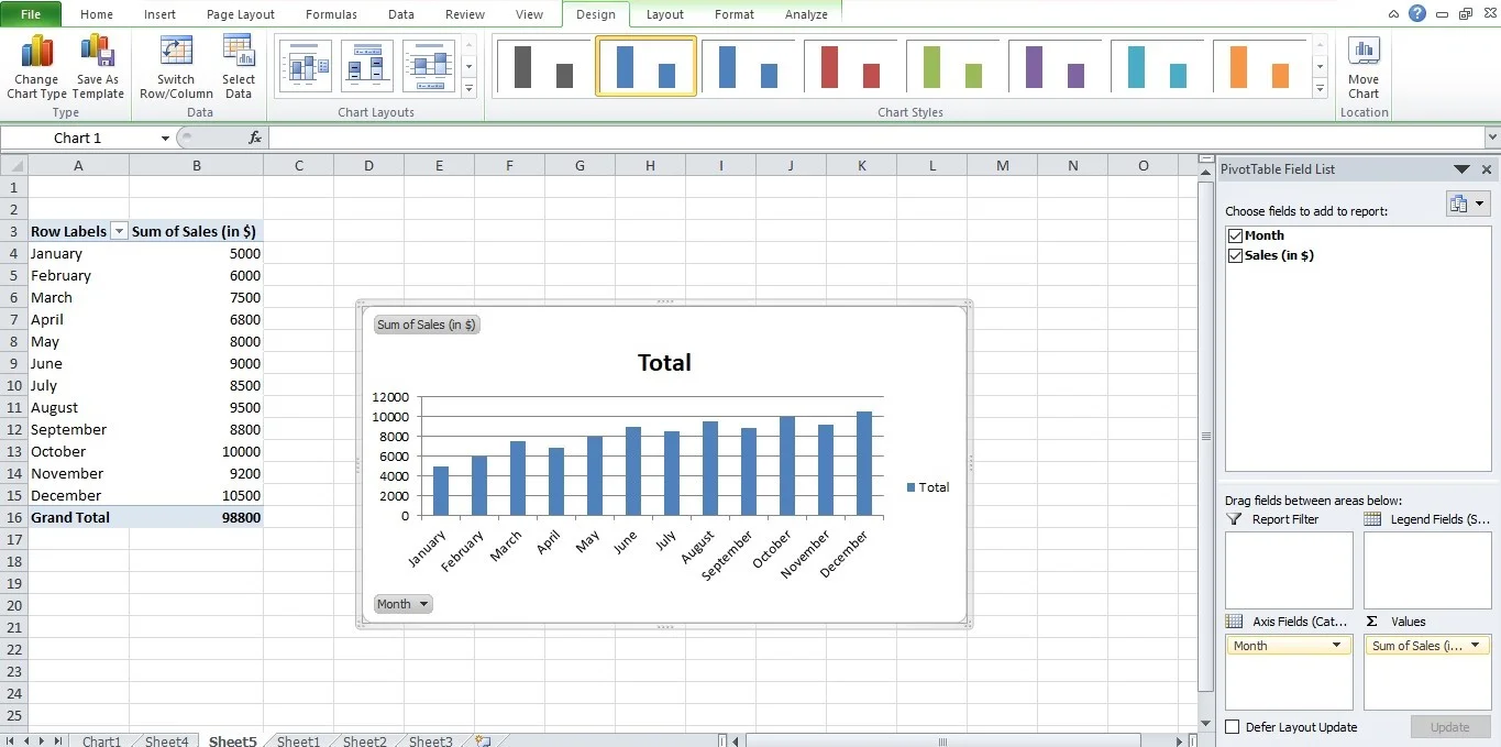
- Excel will generate a pivot chart linked to your pivot table. You can customize the chart by add the fields from the pivot table to the chart’s elements to create meaningful visualizations.
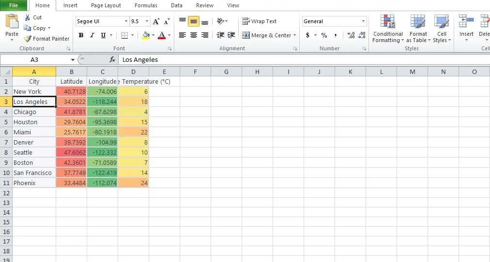
How to Make a Heat Map Visualization in Excel?
Create a geographic heat map in Excel quickly by using conditional formatting. Colors on a heat map represent the individual values.
To make a heat map, follow the procedures below:
- Choose the range
- On the Home tab, select Conditional Formatting from the Styles category.
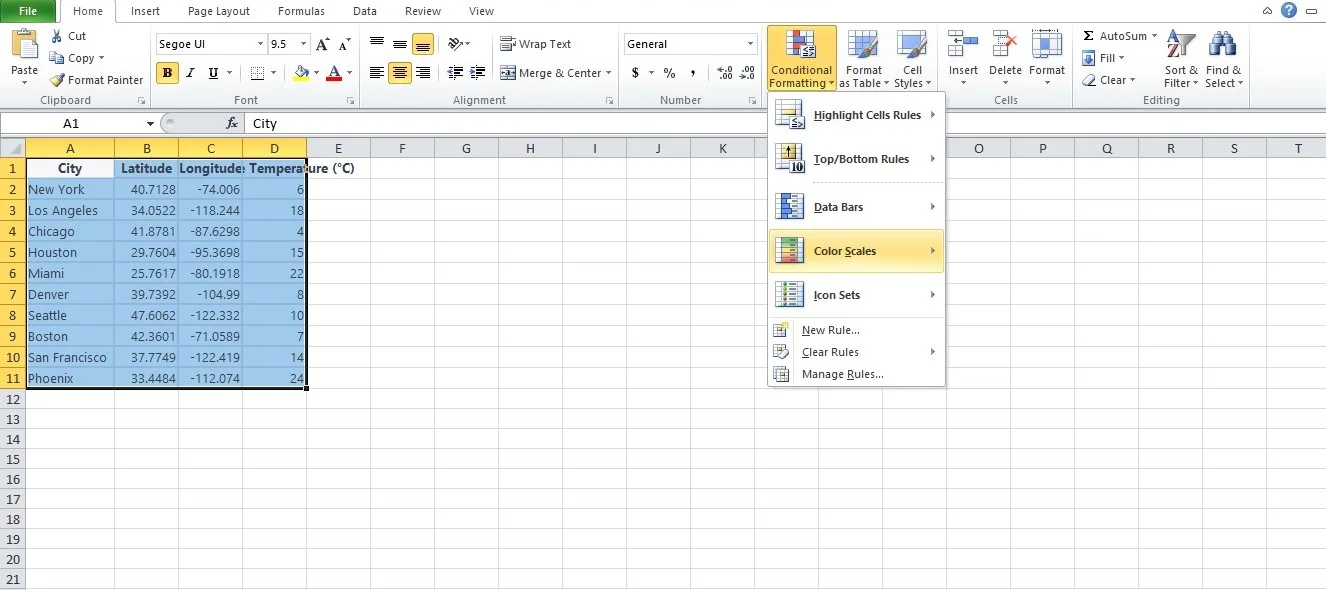
- Under Color Scales, select a subtype.
- Choose the range
- Format Right-clicking or hitting CTRL + 1 will choose a cell.
- Select Custom from the menu.
- Press “OK”
Conclusion
Excel offers data visualization tools, from basic charts to advanced mapping features. You can adapt Excel’s visualization capabilities to their specific needs, whether you are a beginner or an expert.
This article introduced the Excel data visualization concept and outlined various visualization techniques. Excel empowers users to communicate data insights, make informed decisions, and create compelling visual narratives, enhancing data analysis processes.
With over two decades of experience in writing about Microsoft Excel, Google Sheets, and various other spreadsheet tools, Muhammad Nadeem Salam is your go-to expert for all things data. Since 2004, he has been passionately sharing his knowledge and insights through engaging and informative blog posts, helping countless readers unlock the full potential of their spreadsheet tools.