Introduction:
Welcome to the world of data visualization! In today’s data-driven landscape, the ability to effectively communicate insights is paramount. Excel, with its powerful charting capabilities, serves as a beacon for analysts, marketers, and decision-makers alike. Join us as we embark on a journey through the vast landscape of charts and graphs in Excel, empowering you to unleash the full potential of your data.
Different Types of Charts and Graphs in Excel and their Uses
Basic Charts and Graphs in Excel:
1. Column Chart:
Description:
The column chart is a staple in data visualization, representing data using vertical bars. Each column’s height corresponds to the value it represents, making it easy to compare different categories.
Use Cases:
Comparing sales figures for different products or services.
Showing trends over time, such as monthly revenue or quarterly performance.
Example:
Imagine you’re analyzing sales data for a retail store. By creating a column chart in Excel, you can visually compare the sales figures for various product categories, identifying top performers and areas for improvement at a glance.
2. Bar Chart:
Description:
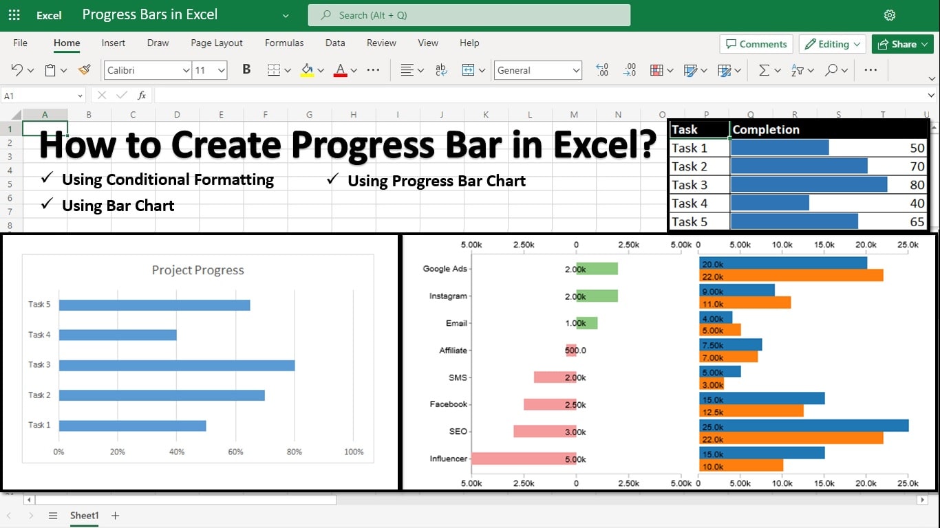
Similar to the column chart, the bar chart uses horizontal bars to represent data. It’s particularly useful when comparing categories or displaying data that needs a horizontal orientation.
Use Cases:
Visualizing survey results across different demographic groups.
Comparing market shares of competitors in a specific industry.
Example:
Suppose you’re conducting a customer satisfaction survey. By creating a bar chart in Excel, you can illustrate the percentage of satisfied customers in different age groups, providing valuable insights for targeted marketing strategies.
3. Line Chart:
Description:
The line chart is ideal for showcasing trends and patterns over time. It connects data points with straight lines, allowing you to visualize changes and fluctuations with clarity.
Use Cases:
Tracking stock prices or market trends.
Analyzing website traffic and user engagement metrics.
Example:
Let’s say you’re monitoring website traffic for an e-commerce platform. By creating a line chart in Excel, you can track the number of daily visitors over a month, identifying peak traffic periods and optimizing marketing efforts accordingly.
4. Pie Chart:
Description:
The pie chart represents proportions within a whole by dividing a circle into slices. Each slice’s size corresponds to its percentage of the total, making it easy to visualize relative proportions.
Use Cases:
Illustrating market share distribution among competitors.
Showing the composition of a budget or expense categories.
Example:
Imagine you’re presenting the market share of different smartphone brands. By creating a pie chart in Excel, you can visually highlight each brand’s share of the market, providing stakeholders with a clear understanding of the competitive landscape.
Advanced Charts and Graphs in Excel:
5. Scatter Plot:
Description:
The Scatter Plot is used to visualize the relationship between two variables. Each data point represents a combination of values on the x-axis and y-axis, allowing you to identify correlations and patterns.
Use Cases:
Analyzing the relationship between advertising spending and sales revenue.
Studying the correlation between temperature and ice cream sales.
Example:
Suppose you’re examining the relationship between study hours and exam scores. By creating a scatter plot in Excel, you can plot each student’s study time against their exam score, identifying any trends or outliers in the data.
6. Area Chart:
Description:
The area chart is similar to the line chart but with the area below the line filled in. It’s useful for visualizing cumulative changes over time or comparing trends across multiple datasets.
Use Cases:
Tracking changes in inventory levels over time.
Comparing quarterly revenue performance across different product categories.
Example:
Let’s say you’re analyzing quarterly sales data for a retail business. By creating an area chart in Excel, you can visualize the cumulative revenue generated by each product category over the course of a year, identifying seasonal trends and growth opportunities.
7. Bubble Chart:
Description:
The bubble chart extends the capabilities of the scatter plot by adding a third dimension: the size of the data points. Each bubble represents a data point with values on the x-axis, y-axis, and bubble size, allowing for more complex visualizations.
Use Cases:
Comparing countries’ GDP, population, and area.
Visualizing demographic trends with multiple variables.
Example:
Imagine you’re analyzing demographic data for different cities. By creating a bubble chart in Excel, you can plot each city’s population (y-axis), median income (x-axis), and median age (bubble size), providing insights into population distributions and socioeconomic trends.
Specialized Charts and Graphs in Excel:
8. Histogram:
Description:
The histogram is used to visualize the distribution of data by grouping values into bins and displaying the frequency of each bin as a bar. It’s particularly useful for identifying patterns and outliers in large datasets.
Use Cases:
Analyzing the distribution of exam scores or grades.
Understanding customer demographics, such as age distribution or income levels.
Example:
Suppose you’re analyzing the distribution of exam scores for a class. By creating a histogram in Excel, you can group the scores into bins (e.g., 0-50, 51-100) and visualize the frequency of scores within each bin, helping to identify any patterns or areas for improvement in student performance.
9. Waterfall Chart:
Description:
The Waterfall Chart is used to visualize the cumulative effect of sequential positive and negative values on a total. It’s commonly used in financial analysis to illustrate changes in revenue, expenses, or net income over time.
Use Cases:
Analyzing changes in company profits or cash flow.
Visualizing budget allocations and variances.
Example:
Let’s say you’re analyzing a company’s annual financial statements. By creating a waterfall chart in Excel, you can visualize the impact of various factors (e.g., sales revenue, operating expenses) on the company’s net income, identifying key drivers of profitability and areas for cost optimization.
10. Radar Chart:
Description:
The Radar Chart, also known as a spider chart or star chart, displays multivariate data on a two-dimensional graph with multiple axes radiating from a central point. It’s useful for comparing the performance of multiple variables across different categories.
Use Cases:
Evaluating athletes’ performance across different sports categories.
Assessing product features based on multiple criteria.
Example:
Imagine you’re comparing the performance of different athletes in various sports. By creating a radar chart in Excel, you can plot each athlete’s scores (e.g., speed, accuracy, endurance) on different axes, providing a visual comparison of their strengths and weaknesses across different sports.
11. Box Plot:
Description:
The box plot, also known as a box-and-whisker plot, provides a graphical summary of the distribution of data through five key values: minimum, first quartile, median, third quartile, and maximum. It’s particularly useful for visualizing variability and identifying outliers in datasets.
Use Cases:
Analyzing test scores or exam results across multiple students or classes.
Understanding the distribution of customer satisfaction ratings or product reviews.
Example:
Suppose you’re analyzing the distribution of test scores for a class of students. By creating a box plot in Excel, you can visualize the range of scores (from minimum to maximum), as well as the median and quartiles, providing insights into the variability and performance levels within the class.
12. Gantt Chart:
Description:
The Gantt chart is a popular tool for project management, providing a visual timeline of tasks, durations, and dependencies. It’s useful for planning, scheduling, and tracking progress in complex projects with multiple activities and milestones.
Use Cases:
Managing marketing campaigns or product launches.
Coordinating construction projects or event planning.
Example:
Let’s say you’re managing a marketing campaign for a new product launch. By creating a Gantt chart in Excel, you can visualize the timeline of tasks (e.g., market research, creative development, advertising) and their dependencies, ensuring that the project stays on track and on schedule.
13. Pareto Chart:
Description:
The Pareto chart combines bar and line graphs to highlight the most significant contributors to a problem or opportunity. It’s based on the Pareto principle, which states that roughly 80% of effects come from 20% of causes.
Use Cases:
Identifying the most common sources of customer complaints or quality issues.
Prioritizing improvement efforts based on the most impactful factors.
Example:
Imagine you’re analyzing customer feedback for a product or service. By creating a Pareto chart in Excel, you can visualize the frequency of different types of complaints or issues (e.g., shipping delays, product defects) and identify the top contributors, allowing you to focus your resources on addressing the most critical issues first.
Sankey Diagram:
Description:
The Sankey diagram is a powerful visualization tool for illustrating flows and relationships within a system. It displays the flow of energy, resources, or values through interconnected pathways, with the width of the paths representing the flow quantity.
Use Cases:
- Analyzing energy consumption and distribution in a manufacturing plant.
- Visualizing the flow of website traffic through different pages or sections.
- Understanding the distribution of resources in a supply chain or logistics network.
Example:
Imagine you’re analyzing the energy usage in a manufacturing plant. By creating a Sankey diagram in Excel, you can visualize the flow of energy from sources such as electricity, natural gas, and renewable sources to various processes and equipment within the plant. This enables you to identify inefficiencies, optimize energy usage, and reduce costs.
Conclusion:
Congratulations! You’ve embarked on a whirlwind tour of charts and graphs in Excel, unlocking a treasure trove of insights along the way. Armed with this newfound knowledge, you’re ready to conquer the world of data visualization with confidence and flair. So go forth, unleash your creativity, and chart your course to success with Excel at your side. Happy charting!
With over two decades of experience in writing about Microsoft Excel, Google Sheets, and various other spreadsheet tools, Muhammad Nadeem Salam is your go-to expert for all things data. Since 2004, he has been passionately sharing his knowledge and insights through engaging and informative blog posts, helping countless readers unlock the full potential of their spreadsheet tools.
