The ability to utilize and understand data is essential for both researchers and companies seeking to obtain a competitive advantage. When complex datasets are shown and need to turn into understandable, practical insights, data visualization tools or software come into their own to assist.
Data visualization tools are the digital age’s artists, creating eye-catching charts and dashboards to 3D models that are truly immersive. They provide information with a clear picture, making it understandable to both professionals and beginners.
We will explore the best tools for simplifying data visualization in this article. First of all, we will discuss what is data visualization. Let’s get started!
What is Data Visualization?
Definition: The art of graphically representing data to make it easier to understand and analyze is known as Data Visualization.
Data visualization designers have a simpler approach to making visual representations of huge data sets due to data visualization tools. A designer’s task is greatly facilitated by automating the process of developing visualization when working with data sets comprising millions of data points.
Complex data can be turned into understandable graphics using charts, graphs, and interactive dashboards. Additionally, it enables us to quickly recognize patterns and trends.
What Do the Best Data Visualization Tools Have in Common?
The best data visualization tools have the following salient features;
- It should offer thorough instructions and documentation.
- A smoother experience due to the user-friendly design.
- The capacity to analyze and display huge information collections of data.
- Many of these tools may produce interactive graphs as well as a variety of charts, graphs, and maps.
- Pricing is important but a greater price can be justified by enhanced functionality and support.
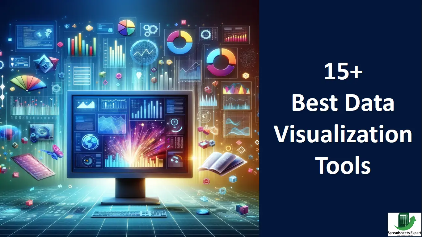
The Best Data Visualization Tools List of 2024
Here, we offer the best 15 tools that may be used by people of all skill levels and needs.
-
Tableau
Tableau is surely among the top ones when it comes to the best data visualization tools. It offers multiple options, such as a desktop application, server, and hosted web versions. There are numerous ways to import data, including CSV files, data from Google Ads and Analytics, and Salesforce data.
Multiple chart formats and mapping functionality are available as output options. If you are a designer then you can now produce color-coded maps that display locally significant data in a way that is much more understandable than a table or chart.
Pros
- Numerous opportunities for importing data
- Map-making abilities
- There is a free public Tableau version available, and there are many video tutorials to help you utilize Tableau.
Cons
- The Tableau Creator software’s non-free editions are expensive ($70/month/user), and the public version restricts you from keeping data analysis private.
Pricing
Its pricing plan is $75 per user/month billed annually.
-
Microsoft Power BI
Power BI from Microsoft is one of the best data visualization tools. It is a flexible tool that works well with other Microsoft apps. It offers significant customization possibilities and strong data modeling capabilities for building dynamic reports and dashboards.
Pros
- It has a mobile app and affordable prices
- If you are familiar with Excel, learning this will be simple for you.
Cons
Heavy CPU use, discord with a desktop version with Mac
Pricing
It has a free plan. Its Power BI Pro plan is $10 per user/month and the Power BI Premium plan is $10 per user/month.
-
Infogram
Infogram is one of the best data visualization tools with full functionality and a user-friendly interface. Create visualizations for social media, dashboards, maps, marketing reports, and more. It supports embedding interactive visualizations in web pages or applications.
A WordPress plugin for smooth installation in WordPress websites. The following file types are available for export: PNG, JPG, GIF, PDF, and HTML.
Pros
- Tiered pricing with a free plan that has capabilities of 35+ chart kinds and 550+ map types are included.
- API for importing new data sources, drag and drop editor
Cons
- Compared to some other applications, it has a lot fewer built-in data sources.
Pricing
It has a free plan. Its pro plan is $25 / month, business plan is $79 / month and team plan is $179 / month.
-
Chart Blocks
The visualization produced by the software can be highly customized, and the chart construction process helps you in selecting the ideal data for your charts before importing the data.
If you wish to insert charts into websites that are viewed on a variety of devices, designers may construct almost any type of chart, and the output is responsive.
Pros
- There are cheap and free premium plans available.
- Data import method with a simple interface
Cons
- Unsure of how reliable their API is, as it doesn’t seem to have any mapping functionality
Pricing
It has a free plan. Its paid plan is USD 10.00 per month.
-
Data wrapper
Data wrapper was developed especially for including graphs and maps in news articles. The produced maps and charts can be posted on news websites and are interactive. The main approach is to copy and paste data into the program.
Charts can be produced after data has been imported with only one click. They use a variety of visualizations, including choropleth and symbol maps, line and bar charts, election donuts, area charts, and locator maps.
Pros
- Made especially for newsroom data visualization
- The tool has a built-in color blindness checker and is suitable for smaller sites.
Cons
- Limited data sources and a few paid plans
Pricing
It has a free plan. It also has a paid plan like a custom plan is $599/month.
-
D3.js
D3.js is an open-source JavaScript library that provides unmatched flexibility for people who are skilled in scripting. It enables you to create unique visualizations from scratch.
These apps consist of Ember Charts, which also employs the Ember.js framework, Plotly’s Chart Studio, which enables designers to create WebGL and other charts, and NVD3, which provides reusable charts for D3.js.
Pros
- Extremely strong and Free and open-source software
- Numerous chart types are available.
- Web standards-focused approaches and tools for non-programmers to produce visualizations
Cons
Requires knowledge of programming to use independently, Accessibility to help is lower than with premium tools
Pricing
It is free available.
-
Google Charts
Specifically designed for producing interactive charts that can be displayed online, Google Charts is a robust, free data visualization tool. It utilizes dynamic data, and only HTML5 and SVG are used for outputs.
Google Spreadsheets, Google Fusion Tables, and Sales Force are some examples of data sources.
Pros
- Numerous chart formats are free.
- Due to the usage of HTML5 and SVG, it is cross-browser compatible.
- Employs dynamic data
Cons
- There is little help available to save the tutorials and blogs.
Pricing
It also has free to use.
-
Google Data Studio
A good choice is Google Data Studio. You can use data from many sources to build educational reports and dashboards within the Google ecosystem.
Pros
- It is free to use.
- Effortlessly integrates with other Google products.
- Supports data from a variety of sources for accurate reporting.
Cons
- Less capacity for advanced data analysis in comparison to premium products.
- The free version might not offer all advanced functions.
- For complicated designs, customization choices could be restricted.
Pricing
It is free to use.
-
Fusion Charts
Fusion Charts is a Dashboard-building tool for mobile and web. It offers a wide variety, with more than 150 different chart styles and 1,000 different map types. This tool interacts with programming languages used on servers, such as PHP, Java, and Ruby on Rails.
It is more concerned with developing dashboards than simple data visualizations.
Pros
- Options for a huge variety of chart and map formats, plus more functionality than a lot of other visualization tools
- It integrates with a variety of different programming languages and frameworks
Cons
- For simple visualizations outside of a dashboard context, it is expensive and impractical.
Pricing
It is free to available. It has also a paid plan as the basic plan is $439/Year, the pro plan is $1,899/Year, Enterprise plan is $3,399/Year.
-
Qlik Sense
Associative data modeling, a specialty of Qlik Sense, allows you to explore data relationships easily. They are especially well suited for companies that need to analyze large amounts of data.
The Qlik Active Intelligence Platform, of which Qlik Sense is a component, provides flexibility and performance for analytics to organizations of all sizes.
Pros
- Automated behavior results in AI insights.
- Drag-and-drop software
Cons
- Interface needs improvement
Pricing
Its standard plan is $20 per user/month and premium plan is $2,700/month.
-
Klipfolio
With Klipfolio, you can use selected instant metrics that are completely pre-built to access and gather information from hundreds of providers without writing any code. You can use data in daily decision-making due to its robust data modeler.
You can import, edit, and analyze data to gain in-depth knowledge precisely.
Pros
- A free plan is available
- Have a large number of integrations
- Every package offers a limitless supply of dashboards and viewers.
Cons
Downloadable PDF reports are not included in the free plan.
Pricing
It has a free version available. Its GO plan is $125.00Per Month and its Pro plan is $300.00Per Month
-
Looker
With the help of its plugin marketplace, Looker is a strong tool that gives users the ability to see data in a variety of ways. It includes a variety of visualizations, including spider visualization, bar gauges, calendar heat maps, and liquid fill gauges.
Its features include analytical blocks that users may use as templates for particular datasets which speeds up analytics. Making data-driven decisions more quickly is made simple with visualization capabilities.
Pros
- Plugin collection for many sorts of visualization
- Stunning graphics, a drag-and-drop interface
Cons
- Data-intensive visualizations can make the tool slower.
Pricing
It’s also free to use.
-
Dundas BI
Dundas BI provides highly customizable data visualizations with scorecards, maps, gauges, and charts that can be easily customized, which makes it easier to create multi-page reports.
Dundas BI examining, transforming, and modeling large datasets simpler by giving users complete control over visual components.
Pros
- Extraordinary adaptability
- Charts and statistics from a wide range of sources
- A variety of standard tools for obtaining, viewing, and changing data
Cons
- No predictive analytics choice
- Not supported for 3D charts
Pricing
SAS Visual Analytics is free to use. Oracle Analytics Cloud is $16 per month/user and SAP Analytics Cloud is $36 per month/user.
-
Chart.js
A simple yet adaptable JavaScript charting framework is Chart.js. It has eight different chart kinds, is open source, and supports animation and user interactivity.
Chart.js generates charts effectively in all current browsers because it employs HTML5 Canvas for output. You can easily customize the generated charts.
Pros
- Free and open-source software
- Cross-browser compatibility and responsive output
Cons
- A lack of help within the official documentation
Pricing
Chart.js is available for free.
-
Grafana
Grafana is free software that enables users to create interactive dashboards. It may be expanded using the thousands of available plugins and supports mixed data sources, annotations, and a range of customized alert functions.
Designers can invite other people to contribute and exchange screenshots of dashboards using export functions. Through plugins, Grafana may access more than 50 data sources.
Pros
- There is a wide range of data sources and chart kinds accessible.
- Enables easy creation of dynamic dashboards
- Able to handle multiple data feeds
Cons
- Compared to some other tools, it doesn’t provide as many choices for visual customization.
- The worst possible choice for producing visualization images
- Websites cannot contain dashboards, but they can contain individual panels
Pricing
It has a free pricing plan cloud-free. Its pricing plan is Cloud Pro $29/month and Cloud Advanced $299 /month.
Data Visualization Tools Comparison
| Tool | Ease of Use | Import Data Options | Chart Types | Interactive Dashboards | Pricing |
| Tableau | Moderate | Multiple options | Multiple | Yes | $75 user/month billed annually |
| Microsoft Power BI | Easy | Wide compatibility | Multiple | Yes | Free, $10/user/month, $10/user/month (Pro) |
| Infogram | Easy | Limited but user-friendly | 35+ charts, 550+ maps | Yes | Free, $25/month, $79/month, $179/month |
| Chart Blocks | Easy | Simple data import | Customizable | Yes | Free, $10/month |
| Datawrapper | Easy | Limited | Various | Yes | Free, Custom Plan ($599/month) |
| D3.js | Advanced | Highly flexible | Various | Limited | Free |
| Google Charts | Easy | Google products | Multiple | Limited | Free |
| Google Data Studio | Easy | Various data sources | Multiple | Yes | Free |
| Fusion Charts | Moderate | Many chart/map options | Multiple | Limited | Free, $439/year, $1,899/year, $3,399/year |
| Qlik Sense | Easy | Associative data modeling | Multiple | Yes | $20 user/month (Standard), $2,700/month (Premium) |
| Klipfolio | Easy | Numerous integrations | Customizable | Yes | Free, $125/month, $300/month |
| Looker | Moderate | Plugin Marketplace | Various | Yes | Free |
| Dundas BI | Advanced | Highly customizable | Multiple | Yes | Varies |
| Chart.js | Easy | Limited chart types | Limited | Limited | Free |
| Grafana | Moderate | Numerous data sources | Various | Yes | Free, $29/month, $299/month |
Conclusion
In conclusion, choosing the right data visualization tool depends on your needs and resources. Tableau and Microsoft Power BI provide powerful features but come at a cost, while Infogram and Google Data Studio provide user-friendly options with varying capabilities.
Look at your budget and make your decision. In addition to the tool, designers need to consider what else goes into making a great data visualization in addition to the tool.
FAQs
Q: What are the most widely used data visualization tools?
The most widely used data visualization tools are:
- Tableau
- Microsoft Power BI
- Google Charts
- Infogram
- Chart Blocks
- Data Wrapper
- ChartExpo
Q: Which visualization tool is best for data analysts?
Tableau, looker, and Qlik Sense are the best tools for data analysis.
With over two decades of experience in writing about Microsoft Excel, Google Sheets, and various other spreadsheet tools, Muhammad Nadeem Salam is your go-to expert for all things data. Since 2004, he has been passionately sharing his knowledge and insights through engaging and informative blog posts, helping countless readers unlock the full potential of their spreadsheet tools.