Microsoft Excel is a reliable partner for professionals and students, decreasing work from calculation to research projects. But if you find it difficult to analyze your data, then we have come up with a tool that makes your work easy: Quick Analysis Tool in Excel.
The Quick Analysis Tool offers features to simplify data analysis activities, increase productivity, and improve the Excel experience. This article explores the Quick analysis tool in Excel and how this simplifies your data analysis.
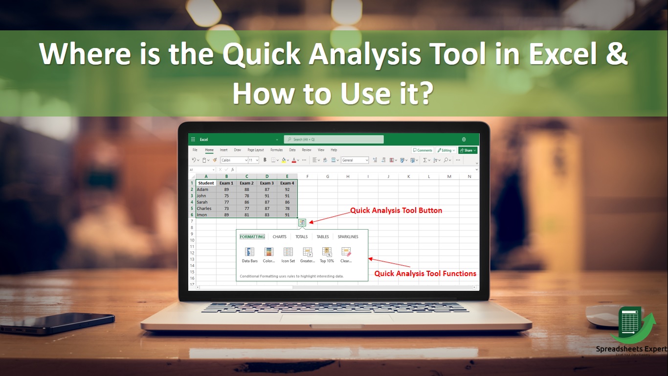
Where is the Quick Analysis Tool in Excel?
To access the Quick Analysis Tool, follow these steps:
- Open your Microsoft Excel application and then create or open a workbook.
- Next, enter the data you want to analyze.
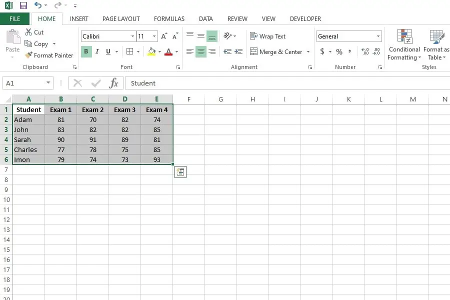
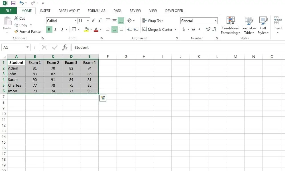
- Select the range of data that you want to perform analysis on. It can be a table, some selected cells, or a data set in a worksheet.
- Once you’ve selected your data, you should see a small icon in the bottom-right corner of the selected range. The Quick Analysis Tool button looks like a small square with a lightning bolt.
- Please hover your mouse pointer over this icon, it will start showing you the tooltip of Quick Analysis Tool.
- Click on the “Quick Analysis” button.
- A menu will appear with various analysis options, such as formatting, charts, totals, tables, etc. You can choose from these options to quickly apply different formatting, calculations, or charts to your data.
Features of Quick Analysis Tool in Excel
Many features in Quick Analysis Excel will make your spreadsheet look arranged and official. The following features of the quick Excel tool will help you in your task:
Instant charts using the Quick Analysis Tool
- Step 1: Choose a set of cells.
- Step 2: Select the Quick Analysis button in the selected data’s bottom right corner or click Ctrl + Q.
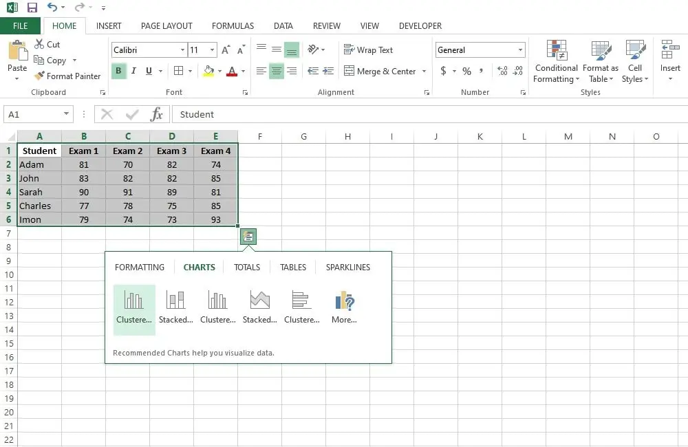
- Step 3: Choose a chart and then select the chart you want.
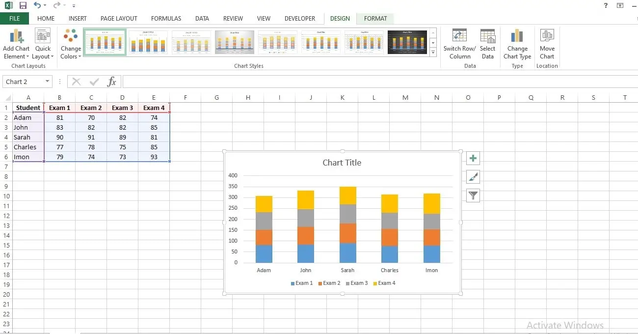
- Step 4: Choose OK when you insert the chart.
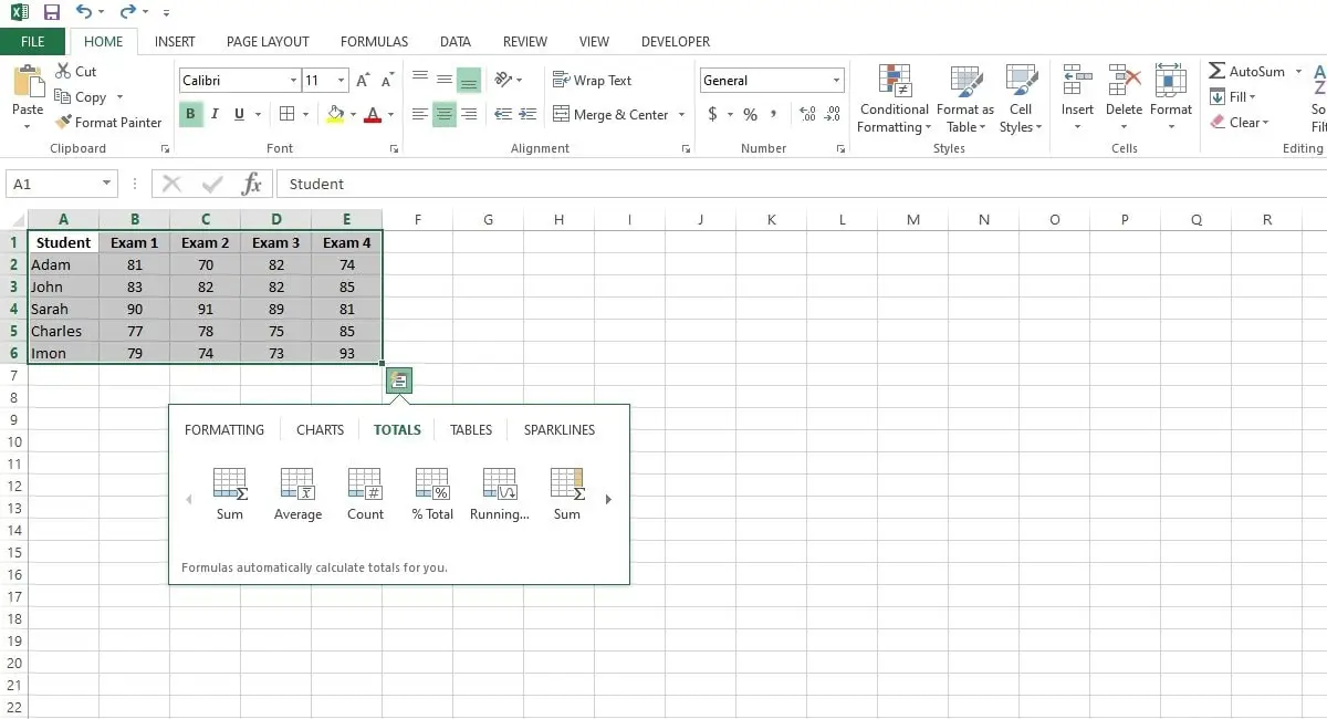
Totals
Use the Quick Analysis tool instead of having a total row at the end of an Excel table.
- Step 1: Select a range of cells and tap the Quick Analysis button.
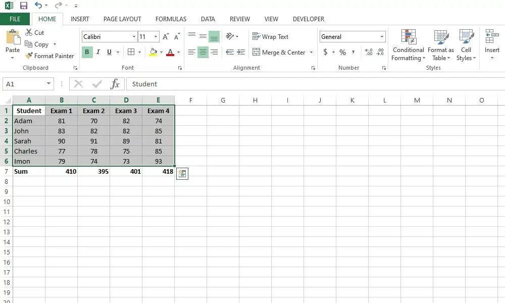
- Step 2: To add the figures in each column, click Totals and Sum.
- Step 3: The final result will come as below.
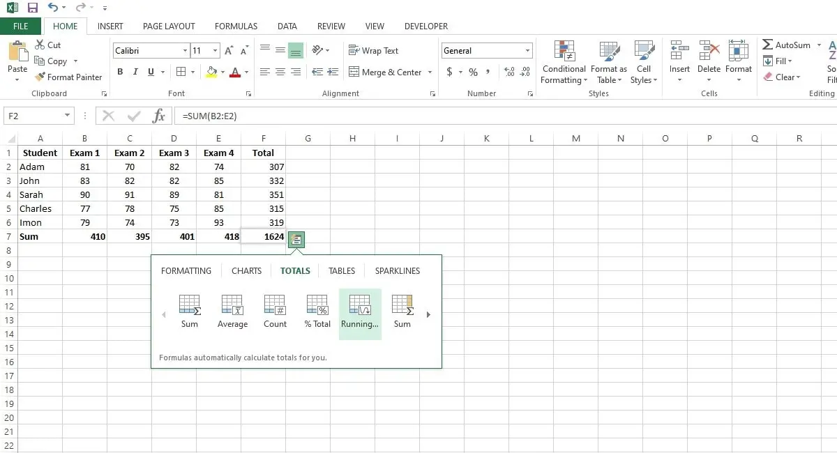
- Step 4: Add a column with a running total and choose the range A1:D7.
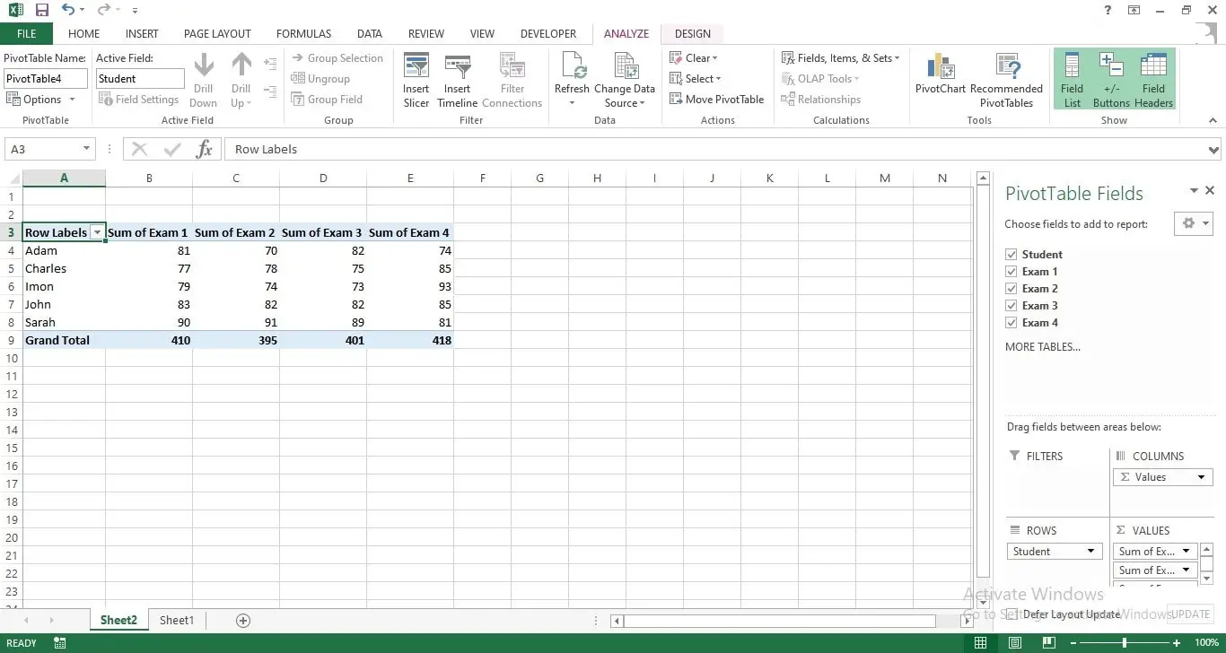
Tables
To sort, filter, and summarize data in Excel, use tables.
- Step 1: Click the Quick Analysis button after selecting a group of cells.
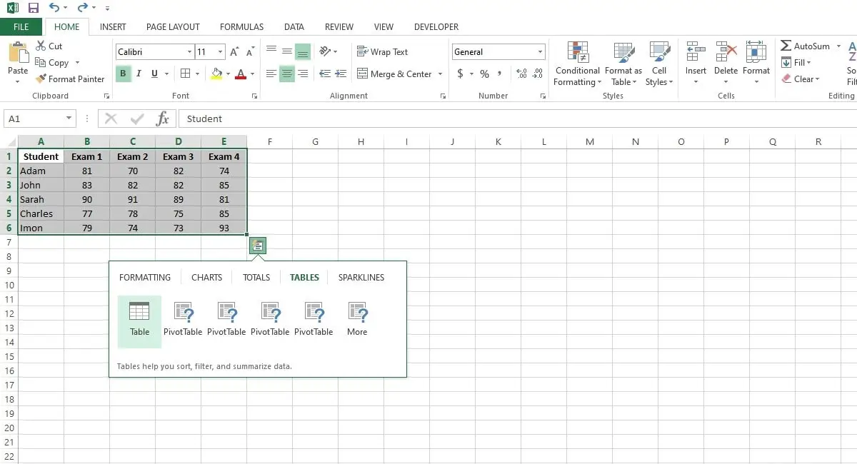
- Step 2: Click Tables and then click Table to insert a table quickly. Or click Tables and select one of the pivot table examples to insert a pivot table rapidly.
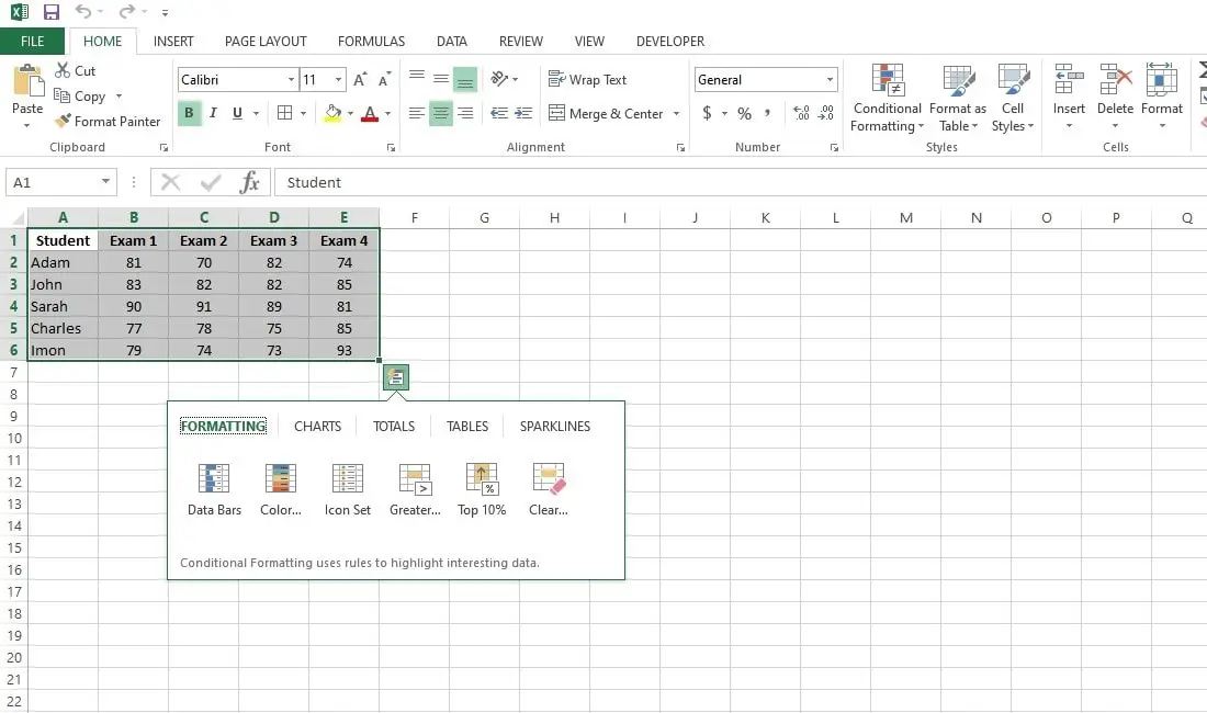
Formatting
Excel’s data bars, color scales, and icon sets make it simple to see the numbers in a group of cells.
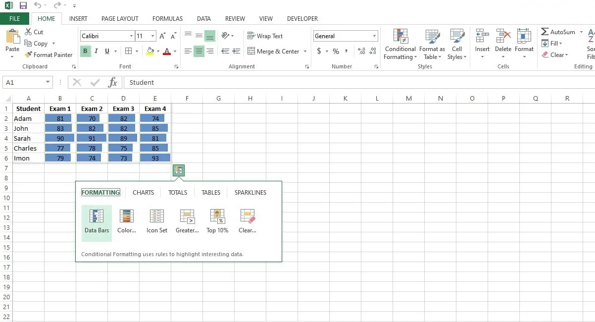
- Step 1: Choose a group of cells, then select Quick Analysis.

- Step 2: Click Data Bars to add data bars quickly.
- A higher value is indicated by a longer bar.
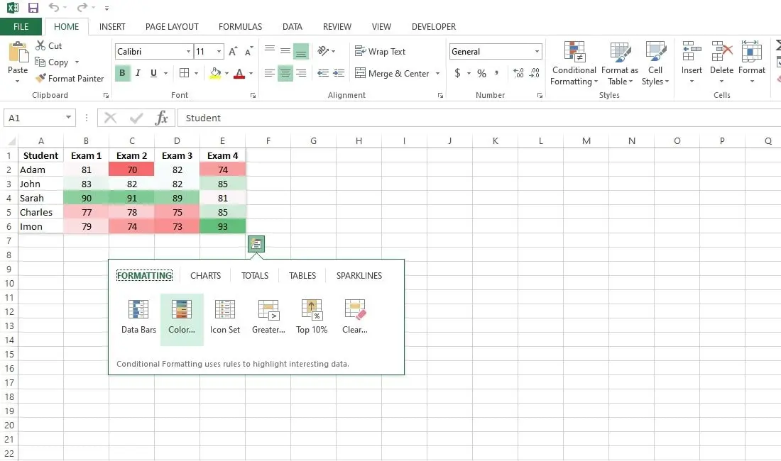
- Step 3: Click Color Scale to add a color scale quickly.
- Step 4: Click Icon Set to add an icon set rapidly.
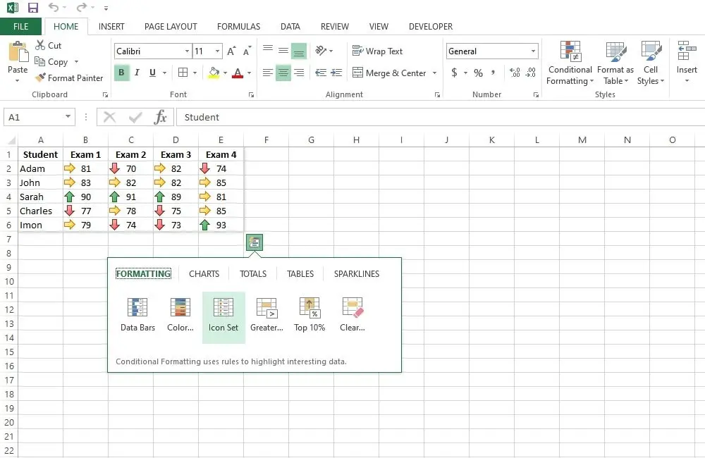
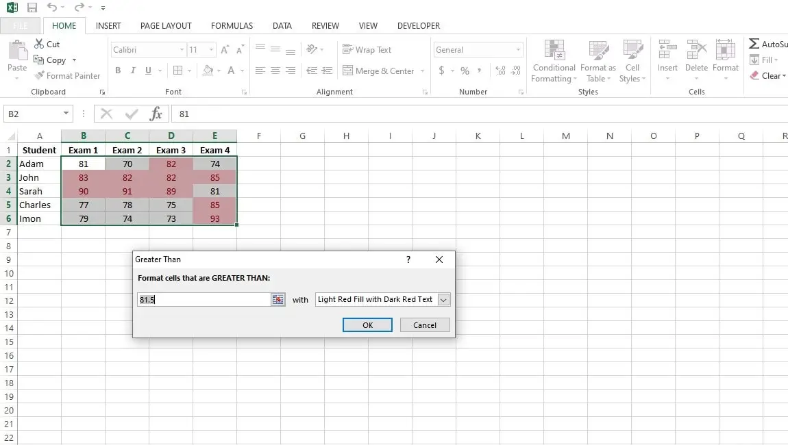
- Step 5: Click “Greater Than” to highlight cells that are greater than a given value instantly.
- Step 6: Tap on OK.
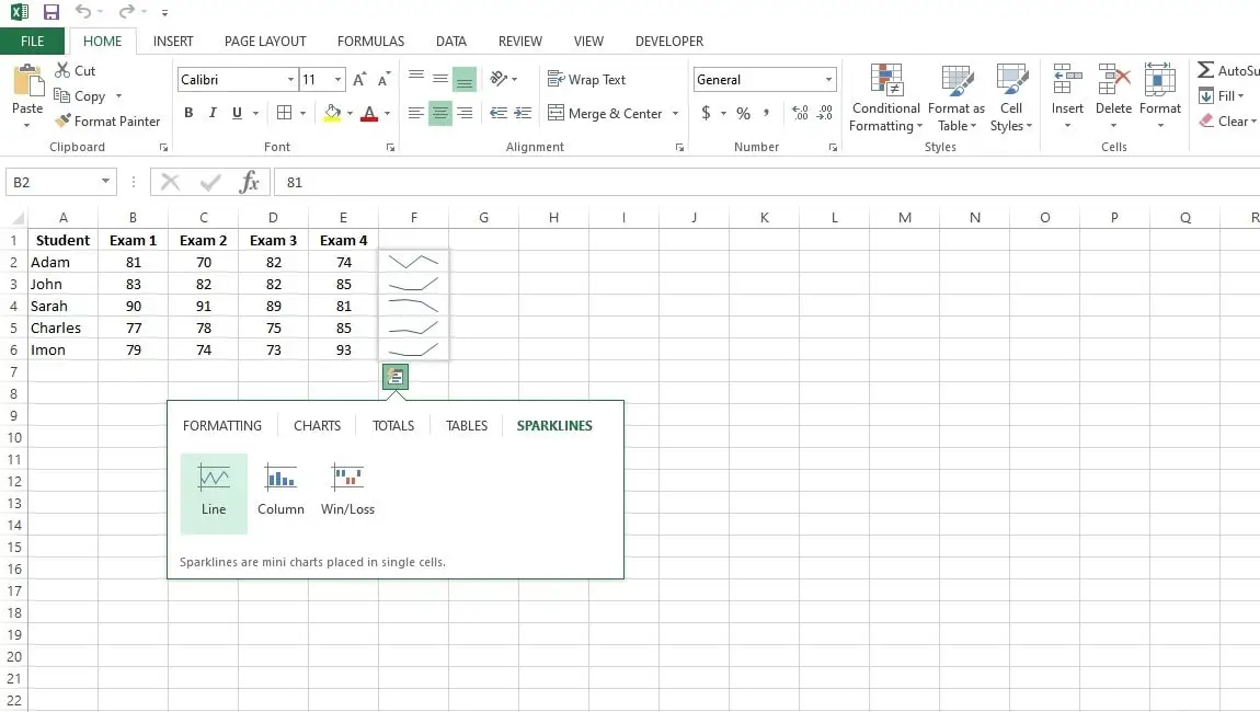
Sparklines Using Quick Analysis Tool
Excel Sparklines are charts that can fit inside a single cell. Sparklines are excellent at showing trends.
- Step 1: Click the Quick Analysis button after selecting the range.
- Step 2: To insert sparklines, click Sparklines and then click Line.
- Step 3: check the result.
Conclusion
The Excel Quick Analysis tool is a useful tool that can greatly increase your productivity and allow you to make quick and more informed decisions.
Every Excel user should have this tool in their toolbox because it makes data formatting easier, offers one-click formulas, and fast graphing features. So, from today, you can relax from complex calculations and enjoy the quick Excel tool.
With over two decades of experience in writing about Microsoft Excel, Google Sheets, and various other spreadsheet tools, Muhammad Nadeem Salam is your go-to expert for all things data. Since 2004, he has been passionately sharing his knowledge and insights through engaging and informative blog posts, helping countless readers unlock the full potential of their spreadsheet tools.